.gif)
.gif)


IWFM Launches Information Management Guide
A new guide to help facilities management professionals strengthen their information management practices has been launched by IWFM. The guidance provides a framework...
Read Full Article.png)
The Leading News & Information Service For The Facilities, Workplace & Built Environment Community
Data is crucial when it comes to managing energy, but communicating it can come with its challenges as data means different things to different people.
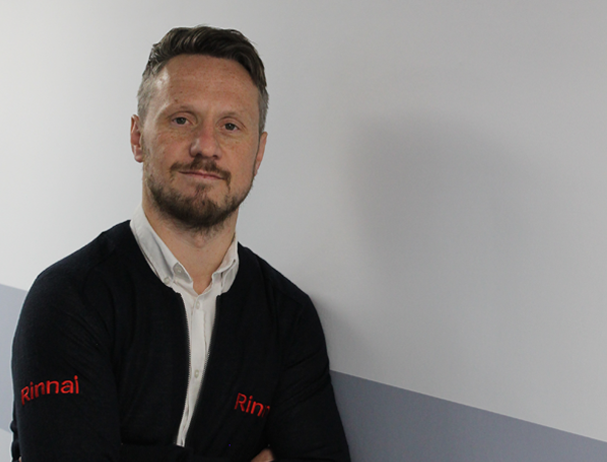
TEAM’s Senior Energy Consultant, Sam Arje, illustrates the art of communicating energy data to your stakeholders.
Sam is an award-winning Energy Manager with extensive experience of establishing successful sustainability strategies and implementing energy projects. Sam is an experienced energy project manager with a passion for sustainability, driving down energy consumption and reducing carbon emissions. As Senior Energy Consultant, Sam's primary responsibility is to lead strategically on the development of TEAM’s consultancy portfolio as well as provide a range of energy management services.

Picture: a photograph of Sam Arje. Image Credit: TEAM Energy
Some people enjoy reading and analysing pages and pages of data and methodology, scrutinising every detail, before focusing on a numeric-heavy summary page. To others, the thought of this is daunting; they simply want a summarised report showing the findings, preferably in graphical format, with few, if any numbers contained within. Many people will fall somewhere in between these two extremes.
It is because of these different approaches that it is important to make sure that you communicate your data in a way that is meaningful.
There is no "one size fits all" when it comes to data; acknowledging this is essential when it comes to communicating to stakeholders within your organisation. It is important that you don’t assume the preferred format of data the recipient would want. Just because someone is a senior director within an organisation does not necessarily mean they want pages and pages of backing data supporting your findings. Of course, some will want this, but others won’t.
Once I worked with a finance director who would send any report back if, in his eyes, there was ‘too much information’ contained within. Conversely, I previously worked with a junior team leader at an Arcade venue within my organisation. In his weekly usage report, he wanted detailed backing data containing half hourly usage of every one of his machines, compared to the same week for the previous 3 years.
"Data means so much more to people if it can be quickly and easily understood. But data that can’t be understood, even if it is 100 per cent correct, is meaningless. Sometimes less is more when it comes to communicating data to others."
Talk, communicate, identify their preference and give them what they want. Data means so much more to people if it can be quickly and easily understood. But data that can’t be understood, even if it is 100 per cent correct, is meaningless. Sometimes less is more when it comes to communicating data to others.
Also critical to remember is that not everyone speaks your language. If you are an Energy Manager, who spends all day, every day, working with energy-related acronyms, keep in mind most people you are sending data to will not know what you mean by an MPAN, SECR or whether 100kWh is a lot or not, on a report.
That said, there is no question about the value of a kWh. The standard unit of a kWh for gas and electricity never changes. 1 kWh of electricity today is exactly the same amount as 1 kWh last year or 5 years ago or 20 years ago. This may be important to emphasise when comparing data over different time periods.
Speak their language when reporting. We all know what the value of a pound is, so maybe convert generic reports being sent out to several people into pounds and pence. Everyone knows that £250,000 is a lot of money but not everyone knows what 1,200,000 kWh of electricity represents.
However, when using pounds or even carbon emissions to compare data you run the risk of misinterpreting the data. In the current landscape we all know that the price of energy is much higher than this time last year. Therefore, a report showing spend increasing by 100 per cent versus last year may look disappointing, but the reality is that this may actually be indicating that consumption (kWh) has fallen, which is a primary goal for an energy manager, if unit rates have increased by more than 100 per cent over the same time period.
Additionally, the generation of 1 kWh of electricity today emits less carbon than Grid averages of a year ago. So seeing carbon emissions fall year on year, looks great, but it actually could be indicating no reduction in energy consumption at all.
To add clarity, why not put an intensity ratio on your data reporting as is required for Streamlined Energy and Carbon Reporting (SECR). Rather than reporting a venue consumed £250,000 or 1,200,000 kWh of electricity over a month, why not consider reporting that the venue, that month, consumed £0.20 of electricity per £10 of revenue generated. At a site I previously worked at, I calculated that in a year-long time period, the intensity ratio was 2.3 kWh of electricity per guest through the door which immediately identified a meaningful calculation for the recipient.
Finally, remember data needs to tell a story. A good story needs a strong beginning, middle and end. This is the case when it comes to data too. The beginning is working out where the data is to be compiled from. The middle is checking and verifying that the data is accurate. The ending is the final presentation of the data to the recipient, in the format he or she will find most useful.
Picture: a photograph of a graph showing a line veering up and down across a typical chart. Image Credit: Unsplash
Article written by Sam Arje | Published 07 February 2023
A new guide to help facilities management professionals strengthen their information management practices has been launched by IWFM. The guidance provides a framework...
Read Full ArticleJoin Mark Griffiths from WMA Consultancy Services as he discusses his recent report on empowering FM professionals to pursue a data-driven future. Mark Griffiths is...
Read Full ArticleDatore has announced a new partnership with Nottingham Trent University, to advance education and practice around affordable analytics. Data analytics platform Datore...
Read Full ArticleBusiness intelligence platform Datore has been appointed to provide analytics services for the Sustainable Facilities Management Index’s Scope 3 Emissions Framework...
Read Full ArticleFM provider Equans is giving its UK employees the chance to develop data analytics, AI and predictive modelling skills through new apprenticeships. Working with tech...
Read Full ArticleData analytics platform Datore has launched its “Analytics as a Service” product, to help facilities managers utilise their data without the need for a...
Read Full ArticleAs consumers we take cloud-based computing for granted, but how can businesses leverage it to make cost savings? We joined MRI Software to discuss how cloud-based...
Read Full ArticleRanjeet Bhalerao is a chartered engineer and CEO and Co-Founder of Mortar IO. ThisWeekinFM met up with Ranjeet to discuss the current challenges facing the commercial...
Read Full ArticleReforms to manage the government’s vast property estate are based on “incomplete data” that risks them being locked into long-term, high-cost...
Read Full ArticleDatore is a business intelligence platform that provides visual analytics and AI solutions to allow companies to optimise their energy usage and sustainability...
Read Full Article
.png)
.png)